National Aeronautics and Space Administration
Goddard Space Flight Center

Space Weather Action Center
Storm Signals
Wind Waves Tutorial
The WIND spacecraft has a radio instrument called WAVES that has multiple functions, but includes radio measurements using a radio receiver called RAD2 that picks up radio waves in the frequencies from 1.075 MHz to 13.825 MHz. Although this does not go up to the 20.1 MHz frequency that we use in standard Radio JOVE kit receivers, we can look at the radio storms received by this instrument and sometimes see that these storms are likely to extend upwards in frequency such that they could be picked up by the RadioJOVE antennas at 20 MHz.
When you use the WIND WAVES data, you will first see the page below.
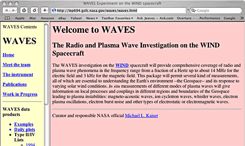
Screenshot of the Wind Waves web site. THIS IMAGE IS NOT LIVE DATA
Click on "Daily Plots" in the left column, and you will see the next page.
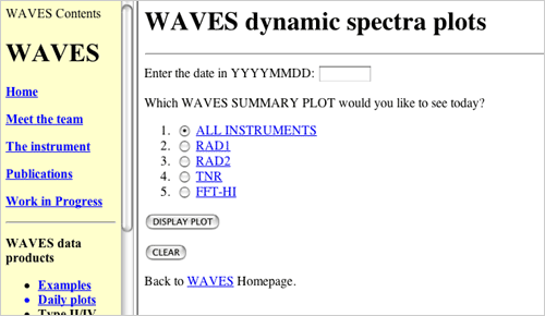
THIS IMAGE IS NOT LIVE DATA
This page allows you to select a day and the RAD2 instrument and display the plot. Since this site displays a whole day of data at once, you wont see today's data until tomorrow. The date is entered as 4 digits for the year, 2 digits for the month and 2 digits for the day. May 27, 2003 would be entered as 20030527. Don't forget to select RAD2 and click "Display Plot". You will see the following for May 27, 2003.
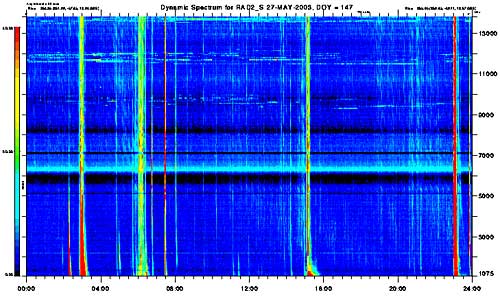
THIS IMAGE IS NOT LIVE DATA
This is a special graph called a radio spectrogram. A radio spectrogram is just a plot of the intensity of radio emission received at a number of closely spaced frequencies as time increases. Spectrograms are often formed by having a receiver "sweep" through the frequencies. It measures the radio emission at one frequency for a short period of time then goes to the next higher or lower frequency and measures again, then the next frequency, and so on. When it reaches the highest or lowest frequency it can measure, it starts over again at the opposite end of the range of the spectrum it can measure. Usually the time intervals between one sweep through the frequencies and the next are so short that the time coverage looks continuous. The vertical axis is radio frequency and the horizontal is time.
The scale on the left side indicates intensity of emissions. The blue color means no or slight radio emissions. Red color means intense radio emissions. Note the flat lines that are often seen on these plots + like the pale blue lines- that extend horizontally across the plot. These are emissions at a single frequency or a narrow range of frequencies. This is usually man-made (radio station) emission. The vertical red or orange lines tell us there is a source that is sending intense emissions in many frequencies for a short time. The source for these is the Sun. These narrow, vertical red and orange lines are called Type III radio emissions and are usually from solar flares. If you remember from the GOES data for May 27, there were 2 M-class flares, a C-class, and then and X-class flare at the end of the day. The RAD2 spectrogram also shows four Type III events, and the last one at the end of the day is the most intense. Let's magnify a small part of the plot showing this intense event.
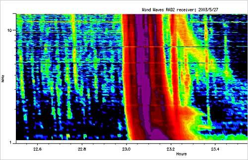
THIS IMAGE IS NOT LIVE DATA
This plot shows the event, but the time span is only about an hour. The event is the nearly vertical red and purple streaks fading into orange and green and lasts about half an hour. Note the orange yellow streak of color (like a backslash '\') starting at 23.2 hours and curving down slowly and fading out in the middle of the plot at about 23.5 hours. This is likely a coronal mass ejection (CME) connected to this flare. The charged particles of the CME start out fast (higher frequency) but slow over time and the frequency gets lower. This is called a Type II or IV flare - it is difficult to distinguish between a Type II or IV, so they are often grouped together.
This plot was obtained from a very special place on the WIND WAVES site. On the first page of the WIND WAVES site you can choose Type II/IV Lists by year. If you click on 2003, you will see the following page.
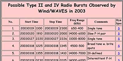
THIS IMAGE IS NOT LIVE DATA
Michael Kaiser maintains a list of all the Type II/IV flares in a table format. Type II/IV flares are most often associated with coronal mass ejections.The previous radio spectrogram is #11 in the list and was chosen by clicking on the blue 's' at the far right.
Now, we have enough information to know if a flare or CME has occurred. But we still don't know where on the Sun the flare occurred. The Latest Events web site would be our next stop.
You are viewing a tutorial
Related Tutorials
The above tutorials compliment the downloadable Flip Charts and Data Sheets.